We're building something new – take a look at the beta site: intglobal.com
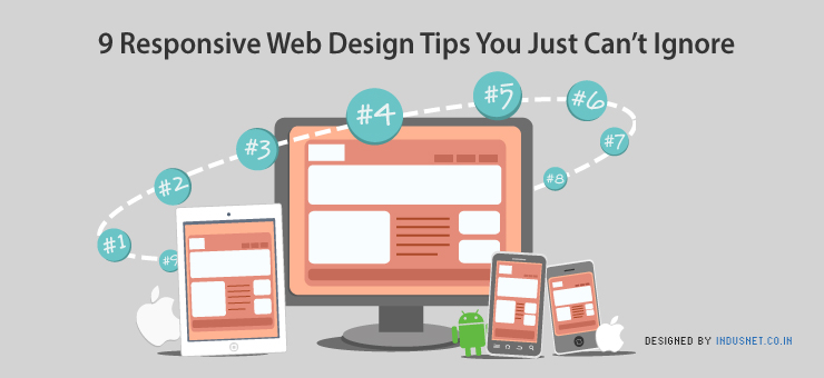
With the advent of different sizes and types of multimedia devices being able to access the internet, it became very necessary for websites to automatically adapt to the display unit of the device to provide optimum viewing pleasure. This concept became colloquial as responsive web designing and turned out to be a big hit amongst mobile phone users in the last couple of years. This style of web designing enables the user’s device to display a device friendly version of the desktop site, which is usually small in size, easier to load and can be navigated swiftly. Of course, websites like these are also great to look at.
Creating a responsive website is a better option than creating a separate mobile site, as it reduces the responsibilities of a website moderator to a great extent. In case of a responsive website the content has to be posted only once and the way it is displayed on desktop and other devices is automatically taken care of. Responsive web designing may make viewing websites a pleasurable experience, but it is definitely a herculean task for the web designers to plan it. We will discuss a few points which will rule out most of the difficulties faced by web designers while designing a responsive website.
1) A simple layout goes a long way in easing the design of a responsive website.
This tip may have been discussed many a times before and may sound like common knowledge but it is one easy way to avoid hassles in responsive designing. Steer clear of all the complications in the HTML code and keep it as basic as possible, the same holds good for the layout. Get rid of unnecessary inline styles, complicated JavaScript and Flash videos, these consume a significant share of memory and are difficult to load on a poor bandwidth, which, let’s face it, most mobile phones have. Do not hesitate to remove redundant text on your website, it not only occupies space but also annoys the users. CS3 special effects may be extremely enticing but they should not be used in tricky parts of the layout, the idea is to keep the HTML as basic and as possible.
2) Maintain brevity in the Web Content.
Content is a vital part of a website, and in case of responsive website it becomes all the more important to plan the priority of the content as the users hope to access the entire content of a website irrespective of the device they are accessing it from. When a responsive website is being planned the content to be published on it should be succinct and not be remotely redundant. Every piece of content should be properly examined and only then should it be given a go-ahead. The content should be prepared judiciously so that its impact on the user remains unaltered irrespective of the medium he is accessing the website through.
3) Make the most of Media Query.
Media Query, as we know, is the cornerstone of responsive web designing, without this technology designing responsive websites would be a painful task. This module of CSS3 allows a responsive website to adapt itself with various parameters associated with the device screen. Owing to this technology the screen resolution, color index, width and height of the of the website can be regulated according to the multimedia features of the device. Using JavaScript for resolution detection can be a tricky business as most browsers do not support it and on prompted there is a likelihood of it being turned off by the users, in which case the script goes for a toss. Media Query does not involve a convoluted and complex script, it is extremely user friendly and can be easily mastered, this upside makes this technology a huge success amongst web designers.
4)Focus on major resolution breakpoints to design your website.
There are six commonly used screen resolutions and they should always be considered while designing a responsive website. Here are basic pointers which will help you in designing the layout for each resolution breakpoint:
With tablets and big iPads it can get a little difficult to zero down on a screen resolution , as the suitable range for these devices is 768 pixel to 1024 pixel.
5) Define the maximum and minimum limits for the size of the elements in your website.
When you are crafting a responsive website it is crucial to set the maximum and minimum limits for the website element to avoid inordinate changes in the shape of the website when it is displayed on extremely small or large devices. Use of a fluid layout makes a website capable to adapt itself to any kind of screen size, but it is essential to fix a limit for it and not allow to grow or shrink exponentially. To optimize the adaptability of a website to a device screen max/min limits should be set for a fluid layout media and this should be combined with media query break points.
6) Using pictures can also be a ‘fluid’ concept.
Another upside of keeping a simple layout is, it eases the mobility of pictures and gives you enough room to experiment with your creativity. There are few pictures on a website which need more emphasis, this can be achieved by setting screen resolution breakpoints for alternate pictures. This tip could help you to play around with the pictures as much as you want to only if the bandwidth is not an issue. While selecting the pictures it is essential that pictures with intricate design pattern should be avoided as they tend to become hazy when displayed on a device with small screen. Restrict yourself from using too many pictures until and unless it is indispensible to the content of the website, by doing this you can have your website load on any kind of device in a jiffy without any hassles.
7)Linear designs work wonders for screens with low resolution.
Arranging content for different resolution breakpoints is quite tricky and exhaustive, to optimize the available space for display designers constantly come up with different patterns. Having said that, there are few thumb rules which must not be overlooked, especially when you are styling low resolution sheets. To utilize the width of low resolution screens entirely, one must arrange the content linearly in one column rather than having it scattered all over the available space. This gives users a definitive linear approach to follow while visiting the website from their devices.
With low resolution screens it is essential to plan the content linearly because the display space available is fairly less for the website to make an impact. This display space should be planned meticulously to avoid any loopholes in management of its content elements.
8) Prioritize your content.
When a user views a website through a mobile or any other low resolution screen he intends to access the main content of the website rather than losing nerve over navigating through unnecessary Ads. Removal of non essential content elements facilitates a user to navigate through your website from low resolution screens. Taking a firm hand with non essential content is imperative as it increase traffic to your website and reduces the chances of inviting spam. Usually Ads, archives and related content is classified as unnecessary information. Users get hopping mad when they have to put efforts in searching for relative material on your page, this might make them shun your website for keeps, so steer clear of content clutter.
9) Pay attention to the of important command buttons.
Almost every mobile phone is touch enabled and users face immense difficulty in accessing few buttons if they are shrunk beyond proportions. Such tiny sizes prompt the users to enlarge the website or close it right away. Sometimes even enlarging does not help if frustrated users lose control over their fingers and enlarge the website beyond the necessary size, so much for just pressing the right button! To avoid a disastrous situation like this set proper size for important buttons like, Submit, Log in, Enter., etc.