We're building something new – take a look at the beta site: intglobal.com
Approximately 7 out of 10 consumers prefer to use mobile website over mobile application. There has been a splurge in the number of mobile shoppers in the last three years. With a number of avenues of online shopping including laptop/PC, mobile and tablets; it is interesting to find that maximum sale conversions in a local purchase occur via mobile.
Marketers must explore new ways of marketing their products through mobile. Using mobile coupons, promo code and offering discounts will attract more users to visit your website through mobile. It will reduce load on your servers and minimize your server capacity and server maintenance cost.
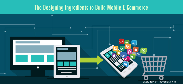
Clearly, marketers can’t ignore mobile e-commerce if they want to succeed in e-retailing. You must have a mobile e-commerce website to cater to mobile shoppers. The design ingredients of a mobile are different from that of a laptop. You have to make sure that consumers have a smooth experience on your mobile website starting from loading a page, searching a product and placing an order.
This article will highlight the crucial elements to build a mobile e-commerce website.
1. Is your search box clearly visible?
Usability factor has a major role to play in mobile. Consumers expect a much simpler interface for mobile unlike desktops. Mobile is so handy and convenient to use on-the-go that consumers don’t even need to give entire attention towards mobile while shopping. Most often, mobile shoppers are indulged in multi-tasking.
Whether they are travelling, reading a book, working in the office or chatting with their friends, mobile shopping can transpire simultaneously. In such a scenario, you can’t expect your customer to locate the search box hidden in a cluttered page. Use a magnified search box so that they don’t have to magnify the mobile page every time they visit it. It is a big turn off. Furthermore, search box should be present on every mobile page to allow the visitors to enter a search query from whichever page they land.
2. Let your happy customers engulf social media space
Majority of the consumers today are active on Facebook, Twitter etc 24×7. They get real-time updates and notifications about anything happening on their social media profile. There is nothing better than a satisfied customer talking about his mobile shopping experience on their social media profile.
After they complete their transaction, you can always request them to share their experience on their Facebook, Twitter, Pinterest etc. Ask them to like and follow on different social media websites. Don’t leave any opportunity unused to expand your social media presence. Consumers love to listen and follow first-hand experience as it testifies your authenticity and mobile-friendly approach by your company. It says that you care about mobile shoppers.
If their friends are satisfied with your mobile shopping experience, they will definitely give it a check. To hear about good shopping experience is convincing and generates a lot of traffic to your mobile store. Though conversion may not happen on first visit, you have opened a line of communication and exposed yourself.
3. Mobile is synonymous to speed
Consumers have always been impatient when it comes to page loading. Mobile shoppers are even more impatient. Their primary reason for shifting to mobile shopping is that it is convenient, fast and accessible on-the-go. Speed becomes the deciding factor here. Getting your PC shoppers to mobile is not going to work for you, if your mobile page takes a long time to load.
It is even disastrous if the page closes automatically during navigation due to a large size. Customers could be in the middle of a transaction. So, you have to be careful what you are promising. The response time of a mobile webpage has to be quick. Don’t clutter your page with a huge number of search results.
Spread your results across pages. Remove unnecessary elements that reduce the speed. Also, remember to add a filter criterion. Due to space constraint, mobile users are stickler about what they see when they enter a search query. Limited information will help you to maintain desired response time.
4. Is your webpage responsive?
Mobile today is available on different operating platforms including Blackberry, Windows OS, iOS, Android etc. Is it designed to operate on all the leading platforms? Can your page adapt to different screen sizes, screen resolution and visual quality? Test your mobile page on all the frameworks before you release it. Customers are scattered across all platforms. You don’t want to lose any Android user. Do you?
A responsive design arranges the text in a fashion that viewing is comfortable irrespective of the amount of text on the page. Customers don’t have to scroll from left to right and right to left to read the text. It should be the first thing that comes into your mind while designing a mobile webpage.
5. Finger-friendly design
It is touch screen everywhere. Smartphone users are used to using their fingers for tapping, browsing and performing other functions on mobile. Make sure ergonomics is taken into account. There is no mouse in case of mobiles. So, the fingers should be able to operate the page smoothly. All the links on the mobile webpage should be easily clicked through the finger. Fat fingers should be easily able to access the links.
Understand the difference between tapping and clicking. The experience of using your mobile webpage should be at least equivalent to that of desktop. Additional tools like drop down and auto-fill should be incorporated into design so that users don’t have to type too much for searching a product.
6. Incorporate instant customer service support into design
Consider your mobile customers as standalone. Consider that they have no laptop or desktop. Mobile is their only source to access your website. In such a case, you have to make sure that customers get instant customer support during their stay on your page. Use a clickable phone number or request for a phone call. Use live chat and instant feedback reply to answer miscellaneous queries of your customers.
Make their mobile experience so smooth that they forget using laptop for accessing your website. This is an opportunity for you to move your customers from computer to mobile. During all this, make sure that your speed does not get affected. Even if there is a transaction failure due to mobile network connectivity issue, your support system should be geared to provide instant support to help customers.
7. Navigational support
Your navigation links can’t clutter the webpage unlike the leverage provided on computers. Your primary focus should be making the crucial navigation elements clearly visible and clickable. You can choose to create subcategories if you have too many navigation links. Use mobile webpage analytics to figure out the most crucial elements. If you feel that text is taking too much space for naming the links, it is always better to use symbols to denote a link.
8. Avoid using too much text
It is understandable that you don’t want to keep away any content from your mobile customers. But you can’t put too much content on your mobile website. Keep your product description for every category concise. Show product description only if the customer wishes to see. Don’t let users to scroll through long pages to get to what they are looking for.
Use pictures in place of text wherever you can. On a phone, it is much more sensible to use pictures because visitors don’t like to read too much text. Use captions with image to provide more clarity.
Conclusion
Mobile e-commerce is catching up rapidly. There is a huge potential in mobile shopping. There are worries pertaining to safe transaction. Make sure your mobile payment gateway is tested well and your designer provides you full support related to technical issues. Marketers should tap new technologies to improve user experience on mobile. They must realize how mobile is changing the game for retailers.
Mobile e-commerce is not limited to mobile webpage but also includes mobile applications. Figure out if owning a mobile application is a good idea for your business as it too adds up your investment cost. The other option is to market your products through third party applications. The only problem with mobile application is that a different coding and design is required for different mobile platforms but mobile webpage can be universally accessed on mobile browsers.