We're building something new – take a look at the beta site: intglobal.com
Before you start reading this article, I would like you to think of a font you like the best. Chances are that you are a lover of Helvetica and hence you chose to read this article, if not, you might dislike Helvetica and would like to see what this article has to offer, waiting for a chance to negate any claim made here! In either case you are free to share your comments on what you think about the famous font, but for me Helvetica has been and will always be my personal favourite.
Helvetica, a sans-serif typeface font happens to be both an infamous and famous designer’s font. It is legible, eye catchy and beautiful in its own minimalist elegance. Could you think of another font which has a movie to its credit? Doesn’t this fact in itself talk about the excellence of the font!
History of the Font
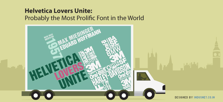
Helvetica was crafted in 1957 by Max Miedinger and Eduard Hoffmann with the idea to create a font which could be used by all and a font that had the most clarity. It was originally called Neue Haas Grotesk and later in 1960 came to be known as Helvetica to make it marketable friendly.
From then on, one could see the font on everything he set his eyes on. Billboards, shop fronts, labels…you turn your head and you would spot the font. As years passed by, thousands of other fonts were created, but none gaining the popularity that Helvetica did.
A Few Reasons Why Helvetica is Hailed as The Best Font
A Few examples: (can we have this in Helvetica…also thought if we could have the entire article in the same font, I don’t have it in my comp)
3M
BASF
BMW
Harley Davidson
Oral B
Panasonic
Toyota
Tupperware
Fonts that tried to compete with Helvetica
Helvetica’s contemporaries were many, imitating it as well as competing with it, but none could match its acceptability. Helvetica’s contemporaries were Univers, Folio and M S Sans Serif. Arial happens to be the only font which almost looked like Helvetica but was in many ways different.
Unknown Facts about Helvetica
Why Helvetica will remain to be the Preferred Font
Helvetica has no doubt become the language of marketing and commerce. Almost all the big shot brands have their corporate logo in Helvetica font. Because of the overuse of Helvetica, it has developed a sense of familiarity to an extent where it is now welcomed by all. Steve Hicks is of the opinion that due to the fonts use in Facebook, the font has gained additional popularity and acceptance and does not pose as a threat to anyone.
It will remain to be the most preferred font because of its simplicity and its versatility to look good in any context.
Why Helvetica though loved so much is Equally Hated
For starters, the Haters of Helvetica claim that the font was based on the font Akzidenz Grotesk. When Helvetica and Akzidenz Grotesk are compared there are no obvious distinguishing features that can be identified. They even believe that Akzidenz Grotesk is a much more elegant and versatile font than Helvetica and it was the aggressive marketing gimmicks that led to its popularity. Marketing the font was so aggressive that Helvetica became the only font that the Swiss used and still continues to dominate its stance over other newly invented fonts. The font is so simple, that it ultimately makes it the first choice for designers, making the designers lazy to experiment with new designs. Even though they do agree that there have been some beautifully crafted designs using Helvetica, the credit goes to the designer for arranging all the elements in a particular way, rather then the font adding to the beauty.
Dislikers’ also believe that using Helvetica for text can be the worst mistake ever to commit, using it as a display face would just be fine, but when used as a text would look its worse. Univers, Venus and Mercator were Helvetica’s contemporaries and all of them faced the same problems as Helvetica did. But the way Helvetica was marketed led to its popularity and the reason for the downfall of the other fonts.
Helvetica has been so overused in the past that the giant corporates thought by just replacing their original logo with Helvetica logo would lead to corporate brand change and messaging!
When we look at Helvetica from a bird’s eye view, then we could say that there are equal numbers of reasons to hate and love it. True, that its overuse can make many a typographers sick to the stomach, but one must also applaud to the various purposes it can serve! There has been no other font which has been so controversial and talked about as in the case of Helvetica. Guess making people react to it itself shows its worth in the typography market.