We're building something new – take a look at the beta site: intglobal.com
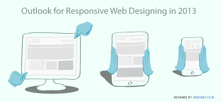
2013 is predicted to be the Year of Responsive Design. RWD or Responsive Web Designing is an approach used to create sites that are compatible for optimal viewing experience across range of devices – i.e. from desktop computer monitors, to tablets and to even smart phones. This design is now being adapted by companies to provide a website that is easy to read and requires minimum navigation in terms of adjusting the screen to fit the device.
The article proves helpful to people who are planning to adopt the concept of Responsive Web Design and also to the amateurs in creating Responsive Web Designs.
What Responsive Web Designing promises:
Less Maintenance: RWD gives you one site that is compatible with all sizes of devices, which means you would not require sites in all different screen sizes. This one site will have the codes of each size centralized in one area, reducing the work of having to go to each code area to make any changes in the site.
Enhanced SEO combined with Easier Web Analytics: RWD provides you with one URL helping you to strengthen your SEO, unlike having one URL for each different site which diluted the SEO’s. The single URL will also help in easy tracking of your website avoiding the practice of going to each URL to pull out data.
Better User Experience: Providing a site that is customized to fit the screen, no matter the size of the device provides the user a comfortable experience in navigating through the site and helping himself with the information he requires.
Social Sharing: RWD makes social sharing easier and more fun. Without RWD, if a user of a big screen shares a site link with a user of a smaller screen then he would not be able to open the link to the website. But in the case of RWD, the link automatically fits itself to the small screen enabling the user to use the site.
What RWD Does Not Promise at the Moment:
Technical Glitches and Introductory issues: RWB is a new concept which has just been introduced. Like any other new entry it will have its own set of rules and techniques that one person has to work with. With time, the RWD concept will grow to adjust as explored further. Implementing RWD to each person’s needs will take time with each new problem arising on its usage.
Limited Creators: As RWD is a new concept, you will not find many people agile in creating the concept. But, again with time, we are sure to have more than a hands full.
Key Things While Creating a Responsive Web Design
Different Browser Widths: Make sure that any particular web design has atleast three versions for each browser width 320px-480px, 480px-768px, 768px+. Now with these dimensions, the website content can fit in well making it readable. Sticking onto three or more fixed layouts and adding margins whenever necessary makes it easier for you to design and implement all the changes. This is not the case in fluid scaling. But on the other hand, fluid scaling tends to provides better user experience on wider range of devices.
Hide Content to the Minimum: Decide on what content you would like the user to see depending on the device used. This does not mean that we punish the user for the device used by him. The most common techniques to ensure most of the content fits all screen sizes is to hide a footer or slider for the smallest screen. But again, this technique should be used to its minimum.
Attention towards CSS Constraints: Ensure your design has page elements that have are pure CSS. This guarantees more flexibility when the pages are modified to fit different screens and also reduced the loading time.
Usage of Same Content and HTML: This means that it would be better to use and reuse the same graphical elements for all the screen sizes. You could also create a graphical image for the biggest screen and then reduce the necessary elements inorder to fit smaller screens.
Apart from the above mentioned, let your imagination create the design combined with coder’s skills.