We're building something new – take a look at the beta site: intglobal.com
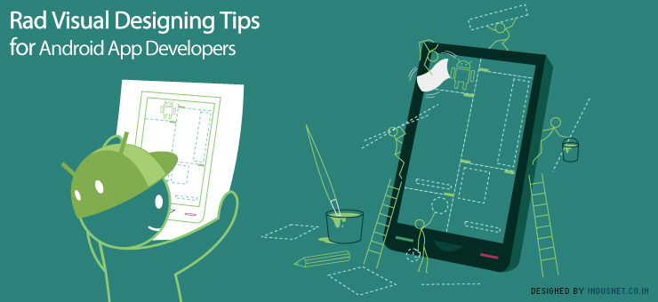
Android platform is challenging to the developers and when aesthetically designed can prove to be visual treat to the customer. This satiating end user experience which is much craved for among the developers, can be a fulfilling experience. The full utilization of the capabilities of android can unleash a wide array of technologically superior mobile devices in the market. But most of the cell phones available in the market do not harness the full potential of the android platform.
The tips listed below with a brief introduction to the basic components involved in design are expected to bridge the gap between the designers and the user to create an enhanced end user experience. Conforming to these tenets of design can also give you the assurance of being consistent with the user requirements. It will be useful for you to develop pixel-perfect graphic assets and nice XML layouts.
Pixels
Pixels are a very important part of the visual design experience. After all, pixels themselves are the basic components that form an image and are the very essence of it. Most of the developers are familiar with User Interface (UI) patterns, but lack the acumen when it comes to visual designing. Exploring the possibility of supplying this lack of expertise can mean the deliverability of high-fidelity mock-ups, drawable resources (i.e., graphic assets) and guidance to the inquisitive developer.
Devices using the android platform come factory-loaded with a mechanism to optimize graphic assets for each density. Manually optimizing is definitely not a good idea. The platform can scale down the resources reasonably well without a lot of hiccups. But it is wise to test designs on low-end devices first and optimize resources that scale badly.
The size of the touch target matters too. Normally, if stylus replaces the fingers, there can be a small size touch target. If fingers are used the size of the touch target should be at least 45 density pixels in width and height.
Markings along the top and left edges define the stretchable areas. The padded content areas can optionally be defined with markings along the bottom and right edges. 9-Patch drawables are essential for creating and customizing User Interface (UI) widgets (i.e., buttons and the like). These drawables can also define the areas for scrolling down a list of options and swiping, which are stretched vertically in the middle of the top of the screen and horizontally stretched at the bottom of the screen respectively.
It is possible to manually define the 9-Patches too, but the android SDK is provided with a nice, simple tool called Draw 9-Patch. This facilitates the quick and easy conversion of a regular PNG into a 9-Patch. It highlights the stretchable area and displays previews of the resulting drawable with different widths and heights.
There are two types of consumers whom you could possibly cater to- one are that fit in with the modern look and the other vouching for familiarity with the design. The former can be provided with a design necessarily throwing strong focus on delivering the current look, feel and experience to all devices, while the latter can be satisfied with a separate style of widgets and drawables used for Android gingerbread and its previous versions.
Branding can be expressed through an appealing design of icons, drawables and widgets, and also with a good choice of colours and fonts. Standard platform widgets can be tailor-made to suit the requirements of the user and aid in striking the right balance between the brand values and platform consistency.
The best way to make mock-ups counted is to work against the screen characteristics of the most popular devices. Ideally, create mock-ups for each alternative layout required by screen size or orientation.
Animated transitions are to be made part of the design when they make sense. This would keep the users distracted or entertained when the apps are loading.
User experience
With Android’s patterns and conventions, users can form expectations about how an unfamiliar app will behave. Here are a few tips to an enhanced user experience.
Besides these tips, the best way to get acquainted with the variables associated with visual designing is to use the android platform every day. The most satisfying app designs have a few things in common: platform consistency, attention to detail and clean visual design. The first two, at least can be picked up by using and analyzing existing android apps.