We're building something new – take a look at the beta site: intglobal.com
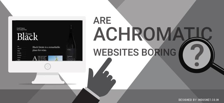
Most corporate websites tend to stick to conservative colors such as grey, blue, red and sometimes yellow even. If you notice, there is a skew towards prime colors which are known to attract people’s attention. However, there is also a subset of companies that make use of achromatic shades. Achromatic shades include grey, black and white. Basically, they include colors that are not typically seen as attractive.
There are a number of reasons why achromatic websites are a good idea. They make your text, videos and images stand out, especially on a white back ground. Moreover, it is known that large white spaces on web pages help people to read text better and also to process information that is published much more easily.
Yet, we often hear arguments that achromatic sites are boring and melancholic. This is not really true. It depends on whom you are targeting and who the audience is. In this article, let us take a look at why achromatic websites are not such a bad idea after all. We will also discuss which might be the best situations to get an achromatic website.
1. Black and white are classic
It is a well known fact that black is a color that will never go out of fashion. Similarly, white is yet another color that will never go out of fashion. When you build a website using only these two colors as predominant shades, they stand out from the rest of the websites that desperately seek to attract attention with the help of bright colors.
2. White spaces are easy on the eyes
White spaces on web pages are known to increase readability. This helps people to understand your message without them having to spend a lot of time. White spaces are also great at helping people process information quickly. No matter what you publish on white space, it is like a blank canvas that helps your text or media to standout.
3. Achromatic shades are stylish
Black, white and even grey are considered achromatic colors that will never go out of style. This is true for websites too. Even after ten years, your website will remain classic and elegant. You will not have to worry about people not ‘understanding’ or ‘getting’ the color scheme you have chosen. Achromatic colors are simply easier to process and everyone understands them.
4. Achromatic sites are less distracting
Most importantly, achromatic schemed websites are less distracting to people. They will not stare at information that is not important to them. The fact that an achromatic website looks simple also means they will also look at your website as something that is more credible. It is a well known fact that people tend to believe simplicity more than complexity, because their brains process simple information more easily.
5. Achromatic sites have a professional look
As they look so simple and clean, they also look more professional than websites that typically come with many colors. This helps you to project an image that is professional, credible and trustworthy. At the end of the day, this is the image you should be looking at communicating to your audience.
Certainly, achromatic websites are not boring
While the fact that achromatic websites are not boring is true, you also need to look at who your target audience is. If you are dealing with an audience that needs to be motivated or energized, it might make sense to use bright colors that are likely to motivate them to take action. However, if you are not dealing with that kind of audience and are looking for style, simplicity and readability, achromatic color schemes should work very well.