We're building something new – take a look at the beta site: intglobal.com
Typography can be broadly divided into two subcategories. They are, microtypography and macrotypography. Both micro and macro typographies are very crucial in ensuring readability of a web page or document. This is one of the reasons why designers often insist on getting things right before working with either micro or macro typographies. By understanding and planning typographical themes before designing a website, we can ensure legibility and readability. The idea is to combine macro and micro typographic techniques so that harmonious and readable web pages can be built easily.
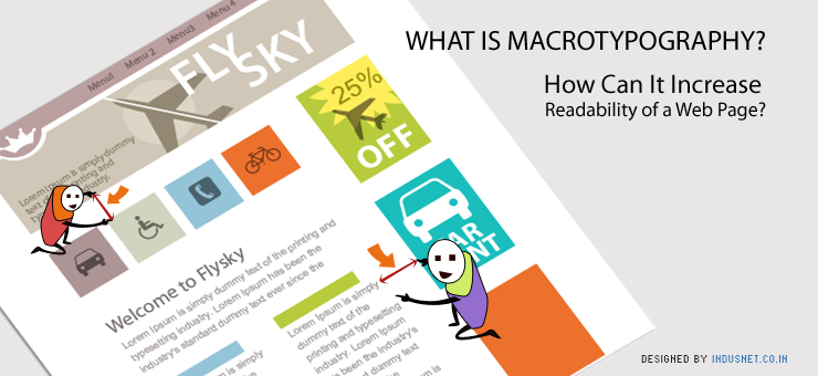
What Are Micro and Macro Typographies?
Microtypography concerns all the details that go into typography. It is all about adjusting the correct glyph, kerning and tracking and making certain choices that improve stylistics. Microtypographical techniques can now be adjusted and manipulated more easily thanks to new CSS attributes which provide better controls over Web type. Microtypography is all about legibility and can be understood as designing letters and words. Thus, the way you design a font, how you decide to let a group of words sit, and how they should look when they are grouped together as a word, and other such decisions are part of microtypography.
On the other hand, macrotypography is all about how typography is arranged on a web page. Macrotypographical techniques can be achieved on CSS but we must also bear in mind that the Web itself is changing rapidly. Macrotypography is all about how paragraphs and groups of sentences are placed together and how they appear on a page.
Readability of a Webpage Correlates with Macrotypographical Techniques
Readability is all about how paragraphs are placed on a web page so that it is easy to read and understand. It has got more to do with aesthetics but also a lot to do with design, reducing eye-strain and maximizing attention and concentration. When readability is increased, user experience (UX) improves too. When a website doesn’t read well, a visitor may be distracted, annoyed, bored or may just leave the web page altogether. If a website is text-heavy and the administrators want people to focus on the printed text than other things on the web page, they must then give importance to readability. At the end of the day, it is all about increasing the process of refinement and making reading on a web page an effortless experience.
The most important aspects of a webpage are placement of ads, navigation tools, related links and the actual text. Our focus must be to highlight the textual content than anything else. Macroreadability is all about how text or typography within this text space is placed so that readability is increased. Margins must be drawn so that there is enough gap between advertisements and navigation bar. Moreover, if there is a lot of white space that is left unused, it is found that readability increases. Content providers must write content in smaller paragraphs and never in large and humongous paragraphs that are difficult to read. Line lengths, margins, font size and other features must be manipulated so that readability increases.
Most typographic professionals often forget to choose the right paragraph style. Paragraph styles can be crafted on CSS and you can choose indents, line breaks and long-form text depending on your convenience and the target audience. Long-form text usually appeals to the more brainy readers than the common ones. Another important consideration is that of the text’s contrast. Low contrast causes squinting and high contrast causes pupils to dilate a lot. Thus, the contrast should be adjusted so that eye strain is reduced or at least minimized.
In summation, we may understand that typographical choices solely do not just depend upon fonts, font sizes and the way colors are manipulated. It also depends on macro factors which include the way a paragraph is placed, how the margins are drawn and how much white space is left. All these factors lead to great typographical results and a better readability index. When a website’s readability increases, the number of visitors who spend a longer tie on the website also increases. With that in mind, if you have any typography related queries, you can contact our web designers and typography specials who will be able to clear your doubts and answer your questions regarding what is best for your business.