We're building something new – take a look at the beta site: intglobal.com
When we design websites, a lot of emphasis is given to typography, images, flash objects and other design elements. The space between these different design elements is called white space, and is often not considered very important.
White Space Is Simple, Practical and Elegant
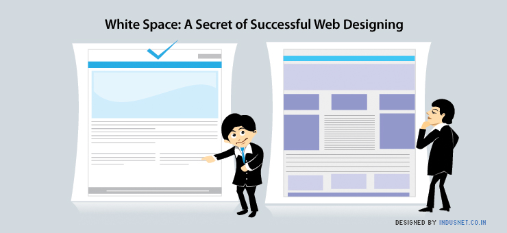
However, white space is consistently rated by cognitive researchers as the single most area of a website. One must remember that white space refers to the blank space between different design elements and does not necessarily have to be white in color. It helps users to scan different sections of web pages and reduces eye strain. The larger the white space on a web page, the more minimalist and uncluttered a website will seem to be. It helps in rendering a website to appear simple, practical and elegant.
Importance of White Space in Web Designing
Roxanne Peterson lists a number of uses to justify the importance of white spaces in web designing. She suggests that a larger white space creates an impression of a valued product and a sophisticated elegance. Many we designers intentionally leave a lot of white space in order to highlight the actual content. Likewise, spacing between lines can help readers to better concentrate on actual text, instead of cramming a lot of words tightly together. Margins and headings can be treated to a lot of white space too, for a similar effect. In effect, it is important to note that white space creates a sense of elegance, importance and value.
Increasing White Space at Micro and Macro Levels
It is a well known practice to increase the leading or tracking in order to make the text appear easier on the eyes. For instance, many websites ensure that there is very little margin or padding around columns of text. However, the space between the lines and letters are increased in order to make the text more readable. This is done in order to increase legibility at a micro level. At a macro level, white space is increased around larger objects such as images or a specific paragraph. This not only heightens a sense of elegance but also thrusts a lot of attention to the object of attention.
Product sites that sell luxury items usually employ this trick in order to create a sense of elegance and importance. Another factor that can be considered is the size of text. When text is disproportionally small when compared with large and unused white spaces, it creates a sense of luxury and art. Many artists employ this tactic to create an aura of refined elegance. It may appear snobbish to some people but this tactic almost always works when it comes to attracting a target audience that seeks exclusivity.
Benefits of Large White Spaces
There are several other reasons than just elegance and aesthetic gains, when it comes to using white space. First and foremost, it offers readers better clarity and readability. It is easier to read text when it is set against an abundant white space, instead of on a web page that is cluttered with a lot of information that is not necessary. Abundant white spaces create a professional appearance which increase sales and is a great way to market oneself online. Larger white spaces place emphasis on content rather than the design of a website. Web designers can use white spaces to separate important elements in an efficient manner. Websites with a lot of white space retain and sustain the attention of visitors better than websites that are cluttered with a lot of information.
Less Is Always More
At the end of the day, less is always more. The more emphasis we give to minimalism and simplicity, the more effectively we shall be able to present our products and services. It is tempting to cram a lot of information on websites in a hope of attracting the reader’s attention. However, this strategy never works and almost always repels readers. The key is to ensure that there is a lot of white space and general spacing between lines, around paragraphs and around images. In fact, the more space we create on our web pages the more effective their message will be. Great websites do not have a lot of design. Instead, they have as little design as possible and this is one of the best kept secrets of web designing.