We're building something new – take a look at the beta site: intglobal.com
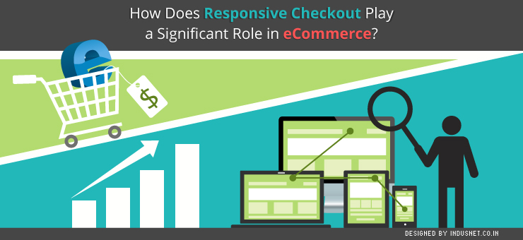
The mobile space has gradually begun to dominate the online space and this is true of e-commerce websites as well. In an effort to capitalize on the mobile traffic, many e-commerce websites began to design mobile websites. Of course, this is a redundant exercise now, considering the changes within the design community. As devices became increasingly diverse and the screen sizes began to vary, developers began to adopt responsive design.
Based on the philosophy of flexibility and intuitiveness, responsive web design rapidly became popular not only among the design & web developer community but also among clients. Today most well-designed websites are responsive in nature. E-commerce websites, which usually cater to an active audience, which is mostly interested in shopping or cataloging, started to toy with responsive design much later. This was because it was harder for e-commerce websites to come up with ways to make websites that worked well on both computers and mobile devices.
This was, especially, true when it came to the checkout process. E-commerce websites today have begun to adopt responsive checkout, which helps in a mobile-first paradigm. This helps e-commerce website owners to concentrate on building businesses, instead of running after incomplete purchases made from tawdry mobile websites of the past. In this article, let us understand the need for responsive checkouts and how they help e-commerce websites.
Responsive Checkout by Shopify
Exceeding number of people have begun to use their smartphones to make purchases. Shopify, the Canadian e-commerce company launched its version of Responsive Checkout in October 2014 and the popularity of the tool has only grown ever since. This points toward a phenomenon that is increasingly mobile in nature.
More than 50% of traffic to e-commerce sites today comes from smartphones and tablets. It is very important to ensure that your online stores use responsive design practices as discussed above. Responsive Checkout is a tool that helps customers to view layouts that automatically adjust to the screen size of their mobile devices.
This avoid scrolling endlessly, entering a lot of information and other discomforts all of which add up to the risk of a customer not making a purchase. Whether a person uses a laptop, smartphone or a tablet, Responsive Checkout ensures that there are no abandoned shopping carts. With all the A/B tests, improving and iterating in order, Responsive Checkout by Shopify is one of the better solutions today.
How does responsive design help e-commerce websites?
As the usage of cellphones increases, the rate of abandoned shopping carts increases too. Smartphones and tablets have a greater chance of distracting the customer. A message could pop-up, a call might just arrive or the customer might feel like taking a selfie. Without being crude, it is important to state that we need to make sure the customer makes the purchase as quickly as possible, without unnecessary distractions.
Responsive design ensures that the customer does not have to scroll down, navigate or enter information on a screen that is already small. Responsive design also ensures that companies are able to hasten the process of checkout so that more sales arrive from mobile devices, which are today’s primary source of traffic.
Responsive design will eliminate the need for frantic calls and emails that one, usually, makes when there is an abandoned shopping cart. By ensuring that sales happen more often, Responsive Checkout helps e-commerce websites to tap into mobile market, instead of being unnerved by it.
What is the future of responsive design with respect to e-commerce stores?
The current trends indicate that people will continue to purchase on mobile phones and tablets, driving a growth for responsive design. E-commerce websites will find it increasingly important to withhold the attention of their customers. Thus, to avoid abandoned shopping carts, it will become necessary to employ responsive design within the checkout process.
Shopify’s Responsive Checkout already exists but you could also speak to professional designers and developers who can help you arrive at custom solutions to create responsive checkout pages. This will help you to reduce lost opportunities and thereby, increase your profits in both short and long terms. Certainly, responsive design will be an important focus area for designing checkout pages on e-commerce stores.