We're building something new – take a look at the beta site: intglobal.com
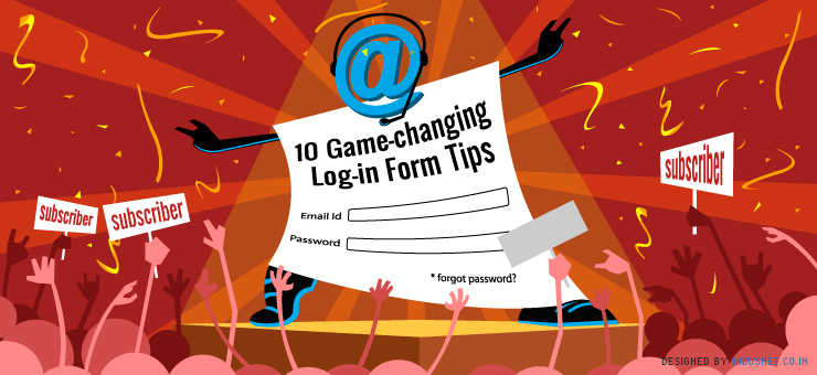
Almost every website features a log in form and it is one section that is checked by every visitor of your website to delve for more information or access his account. Conceptualizing a log-in form to uphold all the key elements and blending it impeccably with the aesthetics of a website may be an uphill task for most of the veteran web designers, but if it is done craftily the results can be very promising.
Having your log in form meet the requirements of your visitors can make them visit your website often without any hesitation. Let us face it, a complicated log in form is a turn off in itself and casts us down to visit a website as a result of which we start looking for a website with less hassles. To have your visitors move away from your webpage just because of an ineffective log in form is the last thing you would want.
Over the past few years, these inefficient log-in forms were outshined by their smarter versions and the results were alarming, this led to a belief that the user friendliness of a log in form is crucial in up keeping the traffic of a website. The log-in page of a website is a doorway to your website and if you bungle up in putting together a decent log-in page you may lose potential customers. We will discuss a few ideas and smart designing tips to optimize the elements in a log-in page of a website.
1. Simplicity is definitely the best policy in this realm.
While filling in a log-in form the last thing a visitor would want is to ladle out personal details. This principle has been well perceived by almost all the website designers hence in most of the cases all you will see a field for username and password, but there are exceptions. A very few websites still feature fields like gender and date of birth which are not only unnecessary but some viewers may find these discriminatory too. Steer clear of such fields until and unless it is very important to the business your website represents or you are legally obliged to feature such fields owing to the content of your website.
2. A standard log-in page is easier to identify with.
It has been observed that visitors of a website can easily identify with the basic elements of a log-in form; any unwanted deviation in the basic structure leaves them in a daze. You may play around with the theme and the color scheme but try to maintain the basic arrangement in the log-in form, have a field for user username or email and just below it place the field to enter password.
With the phenomenal number of user ids a single user owns it is undisputable that the person will forget the password for each user id. It is advisable to have an option for retrieving password, right on the front page of a log-in form. This option saves the efforts taken by a visitor to punch in his username and password only to find out that they were not matching.
3. Helping users with their user id and password.
A smart log-in form identifies the user id and confirms that the password mentioned may be incorrect but the user still has an account with the website. When an incorrect password is punched these websites return with the user name and profile image of the user. This feature is a big hit amongst internet users as it assures them that their account still exists and all that needs to be done is punch the correct password.
As we know that most of the users are irretentive, especially when it comes to remembering user ids and passwords. There are classic cases when user ids are forgotten, leave alone passwords. There are few websites which immediately revert with a message “No account found for this email address” and confirm whether the account associated with the user id mentioned by you is valid or not and prompts you create a new account right them and there.
4. Asking for password time and again creates room for error.
Few sign-up forms prompt users to type their passwords time and again in separate fields, this may ensure safety but it definitely puts users off. It is understandable that asking for password time and again may be an essential requirement of the business that the website is associated with, in which case it must not be avoided. This feature is mainly noticed in websites which deal with monetary transactions. If it is not a vital requirement of the business, this feature should be avoided.
5. Not every website needs CAPTCHA
CAPTCHAs are primarily used to employ a screening procedure which keeps spam at bay. Conventional CAPTCHAs demand the users to decipher and type the cryptic distorted letters which annoys most of the internet users. This screening approach cannot be avoided for websites which are haunted by spams, but for others this approach can be dropped. Most of the users are extremely fussy about filling in the CAPTCHA text and have a propensity to avoid logging into the website just because of this seemingly unnecessary test. There are few smart ways to avoid CAPTCHA, designers can resort to using Honeypot Captcha approach or have a Javascript on the client-side generate a hidden text field which spambots cannot fill on their own.
6. Let the users use their email address as log in ids.
This is by far the easiest way to get users hooked onto your website, as no one fancies remembering user names. Usually users register the same email address with all websites and when they are given an option of using their email address as their user name they heave a sigh of relief as they do not have to remember the user name. This feature can relieve the users from the pain caused by their selective memory.
7. Do not direct users to a different page to fill in log in forms.
Believe it or not, getting directed to a new page just to fill in the log in form is mostly perceived as an uphill task by most of the users. It is extremely distracting when you are working on a page and you get directed to a new page just to log in. To avoid this situation you can either have a drop down box or go for a modal window. Both the options are in vogue and are used by most of the leading websites; they facilitate the user to return to the current page as soon as the login is complete.
Drop down log in form is usually small in size and loads within no time; it comes very handy if the log in form does not have many fields to fill in. A modal window ideally opens in the middle of the page and offers enough space for the other fields; it can be used for brief sign up form as well.
8. Have a large ‘submit’ button.
While designing a log-in form, it must be kept in mind that the basics must not be ignored, one of which is having a wide ‘submit’ button. A small submit button fails to make the same impact as a large submit button and this button is perhaps the only button on the log-in page that is hit each time an entry is made. Hence it is imperative that the button should be easy to locate and hard to miss.
9. Allow users to log in via different accounts.
It is common knowledge that Facebook and Twitter have managed to have every internet user create an account with them. When you allow users to log in through their accounts on Facebook and twitter without having them to go through the usual log in process, they will access your website with twice the vigor and ease. These social networking sites are frequented by users and they are less likely to forget their user name and password on these websites, this reduces the incidence of users forgetting their log in details.
10. Allow users to unmask their passwords.
Typographical errors manage to creep in no matter how careful we are while typing our passwords and since passwords are usually masked there is no room for correction. Constant rejection of the incorrect password by the website is extremely discouraging for users. To combat this problem log in forms can feature an option which can give users a choice of unmasking the password on request.